
Journals51
Newest
.
3 min read

me.
Yeah, I ignored dA again... are you surprised?
So I worked in that grunt job until August, then I went to work at Swan Lake Christmas Hill Nature Sanctuary, and I'm still there. As well I've gone back to school at UVic, and boy does it feel good to be back.
Anyway I went through my message center again, and I'm also making a point of going shooting far more frequently. So with any luck you'll be seeing more from me soon (those of you who still watch me anyway
Thank you to all who favorited or watched me, I'm sorry I haven't gotten around to thanking you personally like I usually do. So Thank You, I really appreciate that you like my work enough to favorite it or even watch me.
Cheers all,
Lars

Stamp Collection


Join the community to add your comment. Already a deviant? Log In
Hello again
5 min read
me.
So having ignored dA for the better part of a year, I'm back online clearing my message center.
So over the last year I moved back to Victoria, got myself a grunt job, and proceeded to do next-to-nothing. With the money I made I built myself a fancy new gaming computer, got myself a Canon 40D, and a Canon EF 100-400mm 1:4.5-5.6 L IS.
Aside from that I'm still deciding what I'm going to do next year. I'm sure I'll decide sometime soon.
Hopfully updating a few pictures soon.
After about the 5000th deviation I got tired of pressing "next", so I apologize for ones that I haven't looked at. Also thank you for everyone who gave me a favourite and/or a watch. Let's see if I can't make a comeback of sorts.
Cheers all,
Lars
Manually Calibrate Your Monitor
Maybe you browse art every day, maybe you don't, but are you seeing the real art? An improperly calibrated monitor could make it so that you don't see all aspects of the artwork.
There are a few simple procedures to go through to make sure your monitor is calibrated.
First, look at this colour spectrum

You should see a smooth gradient moving from Magenta to Red. If you don't see a smooth transition from one colour to the next, it means that your computer isn't displaying the full colour range that you could see.
Next, look at this white square

This square is pure white, and you should see it as pure white. However, your monitor may be set so that the whitebalance is incorrect. This means that what is supposed to be white is either a slightly blue or slightly orange white. You should be able to enter the monitor menu (using the buttons on the front of your monitor), select the sub-menu labeled "colour" (or "color" for those with american monitors  ), this menu will probably have several presets and one or more adjustable "temperature" values. Select the adjustable temperature setting, and increase or decrease the temperature while looking at the white square. You should see it go either orange- or blue-ish white. Fiddle with the adjustment for a minute, soon you should be able to tell when the square is pure white. Congratulations, you've properly set your white balance.
Last, you need to adjust the brightness and contrast of your monitor. Look at this grayscale showing 17 separate shades of gray
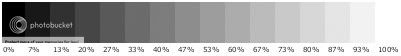
You should be able to differentiate between each shade easily. If you can't, go into the menu settings for your monitor, and increase the contrast to 100%, then modify the brightness until the the monitor is neither glaring bright or too dim. (You can fiddle with these settings until you find a setting you like, as long as you can differentiate clearly between the shades, these settings are just the ones I use.)
There you go, you can now browse art confidently knowing that you are viewing the true colour of the art.
If you have any questions about this (if it's unclear at all, feel free to send me a note and I'll do my best to help you).
Last, you need to adjust the brightness and contrast of your monitor. Look at this grayscale showing 17 separate shades of gray
You should be able to differentiate between each shade easily. If you can't, go into the menu settings for your monitor, and increase the contrast to 100%, then modify the brightness until the the monitor is neither glaring bright or too dim. (You can fiddle with these settings until you find a setting you like, as long as you can differentiate clearly between the shades, these settings are just the ones I use.)
There you go, you can now browse art confidently knowing that you are viewing the true colour of the art.
If you have any questions about this (if it's unclear at all, feel free to send me a note and I'll do my best to help you).
Stamp Collection

Join the community to add your comment. Already a deviant? Log In
I return!
6 min read
me.
So after many, many months of being offline from dA, I return to flood your message centers.
This summer was spent for the most part in Montreal, Canada training with the Canadian Junior National water polo team. That also took me to Eger, Hungary and Long Beach California for Junior World Championships (where the Canadian team placed 13th). After that I went to the Oakanagan region of British Columbia for a holiday, then on to Calgary, Kamloops, and finally Victoria. I have now moved back to Victoria to get a job and go back to school in Fall of next year.
I've ended up with a bunch pictures from over the course of the summer and as we speak I'm updating lightroom and then sorting through all those pictures. So soon enough you'll have some new pictures from me to look at.
Halo 3 is spectacular, if you haven't played it, play it now... and oh man the Legendary ending... omgwtfbbq?!
I'm sure you didn't miss me that much, but I'm back
Cheers all,
Lars
Manually Calibrate Your Monitor
Maybe you browse art every day, maybe you don't, but are you seeing the real art? An improperly calibrated monitor could make it so that you don't see all aspects of the artwork.
There are a few simple procedures to go through to make sure your monitor is calibrated.
First, look at this colour spectrum
You should see a smooth gradient moving from Magenta to Red. If you don't see a smooth transition from one colour to the next, it means that your computer isn't displaying the full colour range that you could see.
Next, look at this white square
This square is pure white, and you should see it as pure white. However, your monitor may be set so that the whitebalance is incorrect. This means that what is supposed to be white is either a slightly blue or slightly orange white. You should be able to enter the monitor menu (using the buttons on the front of your monitor), select the sub-menu labeled "colour" (or "color" for those with american monitors ), this menu will probably have several presets and one or more adjustable "temperature" values. Select the adjustable temperature setting, and increase or decrease the temperature while looking at the white square. You should see it go either orange- or blue-ish white. Fiddle with the adjustment for a minute, soon you should be able to tell when the square is pure white. Congratulations, you've properly set your white balance.
Last, you need to adjust the brightness and contrast of your monitor. Look at this grayscale showing 17 separate shades of gray
You should be able to differentiate between each shade easily. If you can't, go into the menu settings for your monitor, and increase the contrast to 100%, then modify the brightness until the the monitor is neither glaring bright or too dim. (You can fiddle with these settings until you find a setting you like, as long as you can differentiate clearly between the shades, these settings are just the ones I use.)
There you go, you can now browse art confidently knowing that you are viewing the true colour of the art.
If you have any questions about this (if it's unclear at all, feel free to send me a note and I'll do my best to help you).
Stamp Collection
Join the community to add your comment. Already a deviant? Log In
Lightroom works
6 min read
me.
Finally, after hours spent on the phone with Adobe customer support and questioning everyone I know about it, Lightroom has inexplicably installed properly.
..
So last night I ended up staying up quite late (2am ish) post-processing my most recent photos. All of which I've resubmitted (sorry for the re-submitting flood of your message centers) and uploaded print files for. So yes, please have a look at the finished product.
Hopefully I'll be able to get out photographing more now that spring is finally rolling around. You'll be sure to see the results of that
Anyway, not too much else new, my birthday is next Saturday... yeah... I think that's it.
Cheers all,
Lars
/edit later in the day
I made my first stamp for all those users who use Adobe Lightroom

enjoy
/edit 12 april
I made another stamp in hopes of attracting more people to PortableApps.com

Manually Calibrate Your Monitor
Maybe you browse art every day, maybe you don't, but are you seeing the real art? An improperly calibrated monitor could make it so that you don't see all aspects of the artwork.
There are a few simple procedures to go through to make sure your monitor is calibrated.
First, look at this colour spectrum
You should see a smooth gradient moving from Magenta to Red. If you don't see a smooth transition from one colour to the next, it means that your computer isn't displaying the full colour range that you could see.
Next, look at this white square
This square is pure white, and you should see it as pure white. However, your monitor may be set so that the whitebalance is incorrect. This means that what is supposed to be white is either a slightly blue or slightly orange white. You should be able to enter the monitor menu (using the buttons on the front of your monitor), select the sub-menu labeled "colour" (or "color" for those with american monitors ), this menu will probably have several presets and one or more adjustable "temperature" values. Select the adjustable temperature setting, and increase or decrease the temperature while looking at the white square. You should see it go either orange- or blue-ish white. Fiddle with the adjustment for a minute, soon you should be able to tell when the square is pure white. Congratulations, you've properly set your white balance.
Last, you need to adjust the brightness and contrast of your monitor. Look at this grayscale showing 17 separate shades of gray
You should be able to differentiate between each shade easily. If you can't, go into the menu settings for your monitor, and increase the contrast to 100%, then modify the brightness until the the monitor is neither glaring bright or too dim. (You can fiddle with these settings until you find a setting you like, as long as you can differentiate clearly between the shades, these settings are just the ones I use.)
There you go, you can now browse art confidently knowing that you are viewing the true colour of the art.
If you have any questions about this (if it's unclear at all, feel free to send me a note and I'll do my best to help you).
Last, you need to adjust the brightness and contrast of your monitor. Look at this grayscale showing 17 separate shades of gray
You should be able to differentiate between each shade easily. If you can't, go into the menu settings for your monitor, and increase the contrast to 100%, then modify the brightness until the the monitor is neither glaring bright or too dim. (You can fiddle with these settings until you find a setting you like, as long as you can differentiate clearly between the shades, these settings are just the ones I use.)
There you go, you can now browse art confidently knowing that you are viewing the true colour of the art.
If you have any questions about this (if it's unclear at all, feel free to send me a note and I'll do my best to help you).
Stamp Collection


Join the community to add your comment. Already a deviant? Log In
me.
So I know I haven't quite lived up to my word that I was going to catch up with dA. Well... I did partially, I've gone through a bunch of favorites, but I still have 57 odd left to do, and 6781 deviations to look at. Soon.
Life for me is pretty much all the same, eat, sleep, water polo, school. It's likely to continue like that for a while yet. This summer though I get to do a bunch of traveling for training. First I go off to Montreal in the middle of June until the end of July, then I might go back to Eger, Hungary (yet to be determined), then I come back to Calgary until about August 15th, then (if I make the team) I go down to Long Beach, California for Junior Worlds
If any of you are still watching my submissions, you'll notice that I recently submitted a bunch of extremely sharp animal closeups
So for anyone who hasn't noticed, Adobe Lightroom has exited the beta phase and is now shipping. Of course this caused problems for me... as soon as my beta expired, I had a bunch of new pictures to edit. So I've ordered the program, but it'll take a while to ship, so I tried to install the 30 day trial, and boy is it buggered up. The worst thing is I can't seem to fix it. Anyway, I get to wait until my full version before Adobe Support will help me out
I think that's it for now, new pictures soon so keep an eye out.
Cheers all,
Lars
Calibrate Your Monitor
Maybe you browse art every day, maybe you don't, but are you seeing the real art? An improperly calibrated monitor could make it so that you don't see all aspects of the artwork.
There are a few simple procedures to go through to make sure your monitor is calibrated.
First, look at this colour spectrum

You should see a smooth gradient moving from Magenta to Red. If you don't see a smooth transition from one colour to the next, it means that your computer isn't displaying the full colour range that you could see.
Next, look at this white square

This square is pure white, and you should see it as pure white. However, your monitor may be set so that the whitebalance is incorrect. This means that what is supposed to be white is either a slightly blue or slightly orange white. You should be able to enter the monitor menu (using the buttons on the front of your monitor), select the sub-menu labeled "colour" (or "color" for those with american monitors ), this menu will probably have several presets and one or more adjustable "temperature" values. Select the adjustable temperature setting, and increase or decrease the temperature while looking at the white square. You should see it go either orange- or blue-ish white. Fiddle with the adjustment for a minute, soon you should be able to tell when the square is pure white. Congratulations, you've properly set your white balance.
Last, you need to adjust the brightness and contrast of your monitor. Look at this grayscale showing 17 separate shades of gray

You should be able to differentiate between each shade easily. If you can't, go into the menu settings for your monitor, and increase the contrast to 100%, then modify the brightness until the the monitor is neither glaring bright or too dim. (You can fiddle with these settings until you find a setting you like, as long as you can differentiate clearly between the shades, these settings are just the ones I use.)
There you go, you can now browse art confidently knowing that you are viewing the true colour of the art.
If you have any questions about this (if it's unclear at all, feel free to send me a note and I'll do my best to help you).
Last, you need to adjust the brightness and contrast of your monitor. Look at this grayscale showing 17 separate shades of gray
You should be able to differentiate between each shade easily. If you can't, go into the menu settings for your monitor, and increase the contrast to 100%, then modify the brightness until the the monitor is neither glaring bright or too dim. (You can fiddle with these settings until you find a setting you like, as long as you can differentiate clearly between the shades, these settings are just the ones I use.)
There you go, you can now browse art confidently knowing that you are viewing the true colour of the art.
If you have any questions about this (if it's unclear at all, feel free to send me a note and I'll do my best to help you).
Stamp Collection
Join the community to add your comment. Already a deviant? Log In
Featured
Hello again by Hellhuff, journal
Hello again
Manually Calibrate Your Monitor
Maybe you browse art every day, maybe you don't, but are you seeing the real art? An improperly calibrated monitor could make it so that you don't see all aspects of the artwork.
There are a few simple procedures to go through to make sure your monitor is calibrated.
First, look at this colour spectrum
You should see a smooth gradient moving from Magenta to Red. If you don't see a smooth transition from one colour to the next, it means that your computer isn't displaying the full colour range that you could see.
Next, look at this white square
This square is pure white, and you should see it as pure whi
I return! by Hellhuff, journal
I return!
Manually Calibrate Your Monitor
Maybe you browse art every day, maybe you don't, but are you seeing the real art? An improperly calibrated monitor could make it so that you don't see all aspects of the artwork.
There are a few simple procedures to go through to make sure your monitor is calibrated.
First, look at this colour spectrum
You should see a smooth gradient moving from Magenta to Red. If you don't see a smooth transition from one colour to the next, it means that your computer isn't displaying the full colour range that you could see.
Next, look at this white square
This square is pure white, and you should see it as pure whi
Lightroom works by Hellhuff, journal
Lightroom works
Manually Calibrate Your Monitor
Maybe you browse art every day, maybe you don't, but are you seeing the real art? An improperly calibrated monitor could make it so that you don't see all aspects of the artwork.
There are a few simple procedures to go through to make sure your monitor is calibrated.
First, look at this colour spectrum
You should see a smooth gradient moving from Magenta to Red. If you don't see a smooth transition from one colour to the next, it means that your computer isn't displaying the full colour range that you could see.
Next, look at this white square
This square is pure white, and you should see it as pure whi
Does someone want to buy me the Sigma 120-300mm f2 by Hellhuff, journal
Does someone want to buy me the Sigma 120-300mm f2
Calibrate Your Monitor
Maybe you browse art every day, maybe you don't, but are you seeing the real art? An improperly calibrated monitor could make it so that you don't see all aspects of the artwork.
There are a few simple procedures to go through to make sure your monitor is calibrated.
First, look at this colour spectrum
You should see a smooth gradient moving from Magenta to Red. If you don't see a smooth transition from one colour to the next, it means that your computer isn't displaying the full colour range that you could see.
Next, look at this white square
This square is pure white, and you should see it as pure white. Howe